API category list
A menu bar is a horizontal bar typically displayed immediately below a window's title bar. It contains a list of drop-down menus, which can contain menu items, separators, and nested submenus. Individual menu items can be enabled or disabled, checked or unchecked, and may appear grayed to indicate that they are unavailable.
Menus can be created programmatically or designed using a resource editor provided by many integrated development environments (IDEs). The CreateMenu(), AppendMenu(), and InsertMenuItem() functions are among the Windows API functions used to create and modify menus at run time.
Creating a Menu
To create an empty menu at run time, use the CreateMenu() API function. The prototype is:
HMENU CreateMenu();
If the function succeeds, the return value is a handle to the newly created menu. If the function fails, the return value is NULL.
Adding a Menu Item
To add an item to a top-level menu, drop-down menu, submenu, or context menu, use the AppendMenu() API function. The prototype is:
BOOL AppendMenu(HMENU hMenu, UINT uFlags, UINT_PTR uIDNewItem, LPCSTR lpNewItem);
where
hMenu – A handle to the menu to be changed.
uFlags – Controls the appearance and behaviour of the new menu item.
uIDNewItem – The identifier of the new menu item or, when MF_POPUP is specified, a handle to the drop-down menu or submenu.
lpNewItem – The content of the menu item. Depending on the flags specified, this can identify a string, bitmap, or owner-drawn menu item.
If the function succeeds, the return value is nonzero. If the function fails, the return value is zero.
For further detailed reading, see the Microsoft documentation for AppendMenu().
Dynamically Modifying Menus
Modify a Menu
The ModifyMenu() function changes an existing menu item. The prototype is:
BOOL ModifyMenu(HMENU hMenu, UINT uPosition, UINT uFlags, UINT_PTR uIDNewItem, LPCTSTR lpNewItem);
where
hMenu – A handle to the menu to be changed.
uPosition – Specifies the menu item to be changed, as determined by the uFlags parameter.
uFlags – Specifies flags that control the interpretation of uPosition and the content, appearance, and behaviour of the menu item.
uIDNewItem – Specifies either the identifier of the modified menu item or, when MF_POPUP is specified, the handle to a drop-down menu or submenu.
lpNewItem – A pointer to the content of the modified menu item.
Returns nonzero if the function succeeds; otherwise, it returns zero.
For further detailed reading, see the Microsoft documentation for ModifyMenu().
Insert a Menu Item
To insert a new menu item at a specified position in a menu, use the InsertMenuItem() API function. The prototype is:
BOOL InsertMenuItem(HMENU hmenu, UINT item, BOOL fByPosition, LPCMENUITEMINFOA lpmi);
where
hMenu – A handle to the menu where the new menu item will be inserted.
uItem – The identifier or position of the menu item before which the new item will be inserted.
fByPosition – Specifies how uItem is interpreted. If this parameter is FALSE, uItem is a menu item identifier. If it is TRUE, uItem is a menu item position.
lpmii – A pointer to a MENUITEMINFO structure containing information about the new menu item.
Returns nonzero if the function succeeds; otherwise, it returns zero.
For further detailed reading, see the Microsoft documentation for InsertMenuItem().
Deleting a Menu Item
To delete a menu item and any submenu associated with it, use the DeleteMenu() function. The prototype is:
BOOL DeleteMenu(HMENU hMenu, UINT uPosition, UINT uFlags);
where
hMenu – A handle to the menu to be changed.
uPosition – Specifies the menu item that is to be deleted.
uFlags – Specifies how the uPosition parameter is interpreted.
Returns nonzero if the function succeeds; otherwise, it returns zero.
Useful Menu-Related Messages
WM_COMMAND – Sent when the user selects a menu item. The low-order word of wParam contains the identifier of the selected menu item.
WM_INITMENU – Sent just before a menu is displayed, allowing an application to modify the menu before the user makes a selection. Windows sends this message each time a menu is activated, whether by using the mouse or keyboard. The wParam parameter contains a handle to the menu being initialised.
WM_MENUSELECT – Sent to a menu's owner window whenever the user selects or highlights a menu item. The low-order word of wParam contains the identifier of the selected menu item or the index of the selected submenu, while the high-order word contains menu flags describing the selected item. The lParam parameter contains a handle to the menu that contains the selected item.
WM_INITMENUPOPUP – Sent when a drop-down menu or submenu is about to be displayed. This message allows an application to initialise or modify the contents of the menu before it is shown.
The Popup or Context Menu
A popup menu, also known as a context menu, is typically displayed when the user right-clicks a window or control. The term context menu reflects the fact that the commands it contains are relevant to the object or area that was clicked.
The TrackPopupMenu() function displays a popup menu at a specified screen position and tracks the user's selection. A popup menu can be loaded from a menu resource or created dynamically using the CreatePopupMenu() function.
The prototype for TrackPopupMenu() is:
BOOL TrackPopupMenu(HMENU hMenu, UINT uFlags, int x, int y, int nReserved, HWND hWnd, const RECT *prcRect);
where
hMenu – A handle to the popup menu.
uFlags – Specifies how the popup menu is positioned and how it behaves.
x – Specifies the horizontal position, in screen coordinates, of the popup menu.
y – Specifies the vertical position, in screen coordinates, of the popup menu.
nReserved – Reserved and must be zero.
hWnd – A handle to the window that owns the popup menu.
prcRect – Reserved and must be NULL.
Common positioning flags include:
- TPM_LEFTALIGN – Positions the left side of the popup menu at the specified x-coordinate.
- TPM_CENTERALIGN – Centres the popup menu horizontally around the specified x-coordinate.
- TPM_RIGHTALIGN – Positions the right side of the popup menu at the specified x-coordinate.
- TPM_TOPALIGN – Positions the top of the popup menu at the specified y-coordinate.
- TPM_VCENTERALIGN – Centres the popup menu vertically around the specified y-coordinate.
- TPM_BOTTOMALIGN – Positions the bottom of the popup menu at the specified y-coordinate.
The function returns nonzero if the menu is displayed successfully; otherwise, it returns zero.
Example
The example below creates a window with a top-level menu, a drop-down menu, and two selectable menu items. The same commands are also made available through a right-click context menu. Selecting either menu option produces a message beep.

- Details
- Category: API category list
- Hits: 537
A child window, commonly referred to as a control, is a pre-defined window that exists within and depends on a parent window. Controls reduce repetitive development tasks and provide a consistent and familiar user interface. A child control processes its own mouse and keyboard input and notifies its parent window of significant events by sending notification messages, typically through the WM_COMMAND message (or, for some common controls, the WM_NOTIFY message).
Child controls are created using the CreateWindow() or CreateWindowEx() function by specifying one of the predefined window class names, such as "BUTTON" or "EDIT". Windows provides more than twenty types of controls. Six of these, known as the classic controls, are built into the operating system and are available without requiring additional libraries.
Edit Control
An edit control, also known as a text box, allows the user to enter and edit text. The text within an edit control can be left-aligned, centred, or right-aligned. By default, an edit control accepts a single line of text, but it can also be created as a multiline control.
A standard edit control is limited to approximately 64 KB of text. Applications that need to store or edit larger amounts of formatted text can use a Rich Edit control, which is provided by the Windows Rich Edit library.
The predefined window class name used when creating an edit control with the CreateWindow() or CreateWindowEx() function is "EDIT".
Example
In the following, the user can enter a limited amount of text into the edit box. Clicking the button title 'set title' copies Editbox contents to the static box.

Static Control
A static control is commonly used to display labels, instructions, or other information associated with nearby controls. A standard static control cannot receive the keyboard focus and does not normally accept keyboard or mouse input. Unlike most interactive controls, it does not normally send WM_COMMAND notification messages to its parent window.
A static control can display text, simple graphics, icons, bitmaps, or frames. It is created by specifying "STATIC" as the window class name when calling the CreateWindow() or CreateWindowEx() function.
For an overview of creating and configuring a static control, refer to the Edit Control example above.
Buttons
A button is a control that allows the user to initiate an action. When the user clicks a button, it typically sends a WM_COMMAND notification message to its parent window.
A push button, also known as a command button, is a rectangular control that typically displays a text label describing its function. Common examples include the OK and Cancel buttons found in Windows dialog boxes. Push buttons are created by specifying "BUTTON" as the window class name when calling the CreateWindow() or CreateWindowEx() function.
A check box consists of a small square box accompanied by a descriptive label. Check boxes allow users to select or clear independent options and therefore function as toggle controls. Clicking a check box once displays a check mark, while clicking it again removes the check mark. Each change in state generates a notification message to the parent window.
A check box is created using the "BUTTON" window class with the BS_CHECKBOX (or BS_AUTOCHECKBOX) style specified in the dwStyle parameter of the CreateWindow() or CreateWindowEx() function.
Example
In the example below, clicking any checkboxes changes the window's background to a mixture of the corresponding checkbox colour.

A radio button allows the user to select one option from a group of mutually exclusive choices. Each radio button consists of a small circular button and a descriptive label. Radio buttons are normally arranged in groups, and selecting one button automatically clears the previously selected button in the same group. Unlike check boxes, radio buttons are not toggle controls.
A radio button is created using the "BUTTON" window class with the BS_AUTORADIOBUTTON style specified in the dwStyle parameter of the CreateWindow() or CreateWindowEx() function.
Example
In the example below, clicking any radiobutton changes the window's background to the corresponding radiobutton colour.

The Scrollbar
A scroll bar is a control that allows the user to navigate through content or adjust a value by moving horizontally (left and right) or vertically (up and down). It is commonly used when the content within a window or view is larger than the available display area.
A scroll bar consists of a long bar with a button at each end and a movable box called the thumb. The thumb indicates the current scroll position and can be dragged to move through the content. Its size often reflects the proportion of the visible content relative to the total scrollable area.
Scroll bars can either be built into a window or created as separate controls.
The predefined window class for a scroll bar is SCROLLBAR. To add scroll bars to an existing window, include the WS_HSCROLL (horizontal scroll bar) and/or WS_VSCROLL (vertical scroll bar) styles in the dwStyle parameter when calling the CreateWindow function.
Example
The following short program demonstrates the main window's vertical scrollbar by displaying the scroll value within the main window.

The Listbox Control
A list box displays a collection of items in a scrollable rectangular area. It allows users to select one or more items from the list, depending on how the control is configured. Users make selections by clicking the desired item or items.
If the number of items exceeds the available display area, the list box automatically provides a scroll bar, allowing the user to view the remaining items.
The predefined window class for a list box is LISTBOX.
Example
The following short program creates a list box and then adds a limited number of selectable items. Clicking any list item results in the selected listview value being copied to the static box.

A Combo Box Control
A combo box (also known as a drop-down list) combines the features of an edit box and a list box. It allows users to either type a value directly into the edit field or select an item from the drop-down list, depending on the style of the control.
Windows provides three types of combo boxes:
- Simple – Displays the list box and edit box at all times.
- Drop-down – Displays an edit box with a drop-down list that appears when the user clicks the arrow button.
- Drop-down List – Displays only the selected item and the drop-down list. Users can select an item from the list but cannot type their own value.
The predefined window class for a combo box is COMBOBOX.
Example
The following short program creates a dropdown list and then adds a limited number of selectable items. Selecting any list item results in the selected value being copied to the static box.

- Details
- Category: API category list
- Hits: 421
A dialog box is a temporary pop-up window that prompts the user for additional information or requests input before an application can continue with a task. Dialog boxes are commonly used to display settings, collect user input, confirm actions, or present important messages.
Dialog boxes are typically created using a dialog editor and defined within a program's resource file (.rc). A dialog box usually contains one or more controls (child windows), such as buttons, edit boxes, check boxes, radio buttons, list boxes, and combo boxes. These controls allow the user to enter data, select options, or control the application's behaviour.
In addition to user-defined dialog boxes, Windows provides several predefined dialog boxes for common tasks, including selecting colours, opening or saving files, choosing fonts, and printing documents.
Modal vs Modeless Dialog Boxes
A modeless dialog box allows the user to continue interacting with other windows in the application while the dialog box remains open. It stays on the screen until it is explicitly closed by the user or the application.
Typical uses include:
- Find and Replace windows
- Toolboxes
- Formatting palettes
- Search panels
Modeless dialog boxes are commonly created using the CreateDialog() function.
A modal dialog box requires the user to respond before returning to the main application window. While the dialog box is open, the user cannot interact with other windows in the application. The dialog box must be closed before work can continue.
Typical uses include:
- Save confirmation dialogs
- Error and warning messages
- File Open and Save dialogs
- Application settings that must be completed before proceeding
Modal dialog boxes are commonly created using the DialogBox() function.
Creating a Modeless Dialog Box
Modeless dialog boxes can be created using the Windows API function CreateDialog(). The syntax is:
HWND hDlgModeless = CreateDialog(hInstance, lpTemplate, hWndParent, lpDialogFunc);hInstance - A handle to the current application instance.
lpTemplate - Specifies the resource identifier of the dialog box template.
hWndParent - A handle to the parent window that owns the dialog box.
lpDialogFunc - A pointer to the dialog box procedure.
Return value - If the function succeeds, the return value is the handle to the dialog box. If the function fails, the return value is NULL.
Destroying a Modeless Dialog Box
To destroy a modeless dialog box, use the DestroyWindow() function.
BOOL DestroyWindow(HWND hWnd);hWnd - A handle to the window to be destroyed.
If the function succeeds, the return value is nonzero. If the function fails, the return value is zero.
Creating a Modal Dialog Box
Modal dialog boxes are created using the Windows API function DialogBox(). The syntax is:
INT_PTR DialogBox(HINSTANCE hInstance, LPCSTR lpTemplate, HWND hWndParent, DLGPROC lpDialogFunc);hInstance - A handle to the current application instance.
lpTemplate - Specifies the resource identifier of the dialog box template.
hWndParent - A handle to the parent window that owns the dialog box.
lpDialogFunc - A pointer to the dialog box procedure.
Closing a Modal Dialog Box
To close a modal dialog box, use the EndDialog() API function. The syntax is:
BOOL EndDialog(HWND hDlg, INT_PTR nResult);hDlg - A handle to the dialog box to be destroyed.
nResult - The value to be returned to the application by the function that created the dialog box.
Return value - If the function succeeds, the return value is nonzero. If the function fails, the return value is zero.
Processing Dialog Messages
Like a standard window, each dialog box has its own dialog procedure, also called a dialog callback function, which receives and processes Windows messages.
The dialog procedure is responsible for responding to messages generated by the dialog box and its controls. For example, it can respond to button clicks, changes to edit controls, and other user interactions.
Example
The code example demonstrates both a modal and a modeless dialog box. The modal dialog box displays a simple message. The modeless dialog box contains three radio buttons. Selecting any of the radio buttons changes the background colour of the parent window.
Property Sheets
A property sheet is a modeless dialog box used to display and edit the properties or settings of an object. It consists of one or more property pages, with each page displayed under its own selectable tab. This allows related settings to be organised into logical groups.
Users can switch between tabs without closing the dialog, making it easy to view and modify multiple categories of options. Property sheets are commonly used in Windows applications for configuration dialogs and object properties.
For further reading, see the Microsoft Windows Property Sheet Reference.
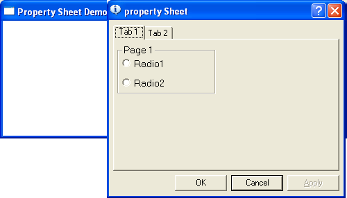
The following short program displays a property sheet containing two pages when the user right-clicks. The first page responds to a radio button click by displaying an associated message box. The second page is for display purposes only. Although this simple demonstration does not set any actual properties, it illustrates how to create a property page template.
A property sheet can also be used to create a wizard. A wizard consists of a series of dialog pages that guide the user through a sequence of steps or options.
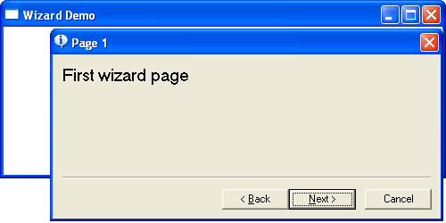
The following short program displays a simple wizard containing three property pages. Right-clicking anywhere in the window initiates the wizard.
Dialog-Based Applications
A dialog-based application is a Windows application in which the main window is a dialog box rather than a standard application window. This approach simplifies development by allowing controls such as buttons, edit boxes, check boxes, and list boxes to be placed visually on the window using the Resource Editor provided by the development environment.
The behaviour of the dialog box is controlled by a dialog procedure, which processes messages generated by the dialog box and its controls. For example, the dialog procedure can respond to button clicks, edit box input, and other user interactions.
Dialog-based applications generally require less code than traditional Win32 applications because much of the window creation and message handling is managed by the Windows dialog manager. As a result, they are particularly well suited to small utilities, configuration programs, and applications with relatively simple user interfaces.
Although dialog-based applications are relatively easy to develop, they are generally less flexible than traditional frame-window applications and are therefore best suited to straightforward applications.
Example
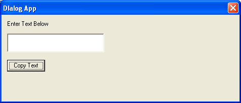
The following example demonstrates a simple dialog-based application. The main window is implemented as a dialog box containing an edit box, a button, and a static text control. The user enters text into the edit box and clicks the button to change the title (caption) of the dialog box to the text entered.
This example illustrates how a dialog procedure processes control events and updates the dialog box in response to user actions.
- Details
- Category: API category list
- Hits: 464
The Common Dialog Box Library provides a collection of predefined Windows dialog boxes for performing frequently used tasks. These standard dialogs provide a consistent user interface across Windows applications, allowing users to interact with familiar controls and workflows.
The library includes dialog boxes for:
- Opening files
- Saving files
- Choosing a printer
- Finding and replacing text
- Selecting fonts
- Choosing colours
- Displaying help information (legacy)
Using common dialog boxes helps ensure that an application follows the standard Windows look and feel. It also improves usability and reduces the amount of code that developers need to write and maintain.
The functions and data structures used by the Common Dialog Box Library are declared in the COMMDLG.H header file. To use a common dialog, an application typically performs the following steps:
- Declare and initialise the appropriate dialog box structure, such as
OPENFILENAME,CHOOSECOLOR, orCHOOSEFONT. - Set the required fields of the structure, such as the owner window, file filters, initial directory, or default values.
- Pass a pointer to the structure to the appropriate common dialog function.
- When the user closes the dialog box, the function returns control to the application. If the user confirms the operation, the structure contains the information selected or entered by the user.
Each common dialog function returns a value indicating whether the user completed the operation successfully or cancelled the dialog, allowing the application to respond accordingly.
For further reading https://docs.microsoft.com/en-us/windows/win32/dlgbox/dialog-box-types
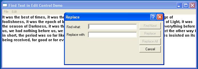
The examples below demonstrate several common dialog boxes, including text find and replace, file open and save, colour selection, font selection, and printer selection.
Select Colour Common Dialog Box
The Select Colour Dialog Box displays a basic set of available colours and also allows the user to create custom colours by specifying RGB values.

File Open/Save Common Dialog Box
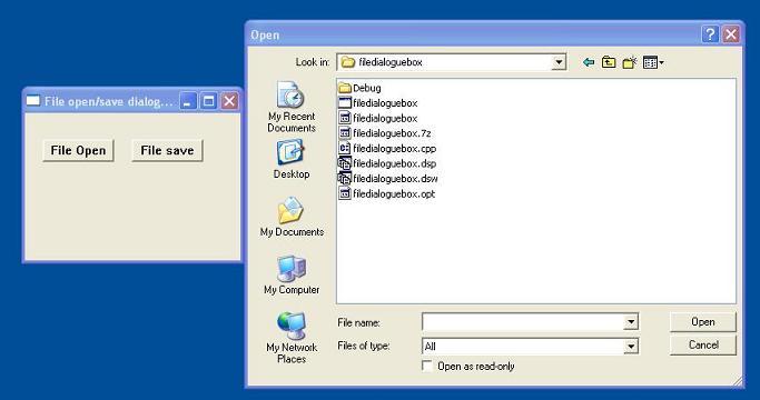
The Common File Open/Save dialog provides a consistent interface for file management operations using the standard Windows dialog interface.
The Open dialog box allows the user to specify the drive, directory, and name of a file or set of files to open.
The Save As dialog box allows the user to specify the drive, directory, and name of a file to save.
Find and Replace Common Dialog Box
The Find and Replace Common Dialog Box displays a modeless dialog box that allows the user to specify a string to search for within a text document, together with additional options for finding and replacing text.
Font Common Dialog Box
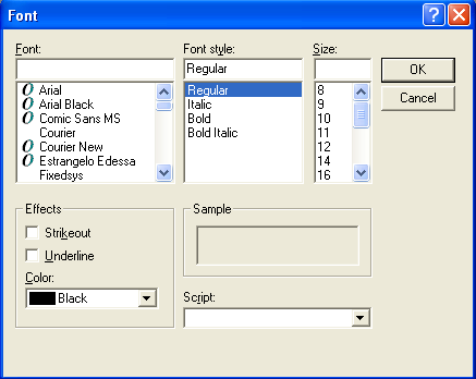
The Font Common Dialog Box allows the user to select a font, style, size, and optional text effects using the standard Windows Font dialog.
Choose Printer Common Dialog Box
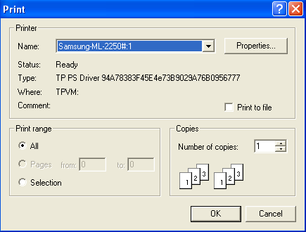
The Printer Common Dialog Box displays the standard Windows Print dialog, allowing the user to select a printer, choose the number of copies, and specify available print options before printing.
- Details
- Category: API category list
- Hits: 360
Windows supports two main types of bitmap: Device-Independent Bitmaps (DIBs) and Device-Dependent Bitmaps (DDBs).
A Device-Independent Bitmap (DIB) stores image information in a standardised format that is independent of a particular display device. The bitmap contains information describing its colour format and pixel layout, allowing the image data to be transferred between different devices and applications without depending on the characteristics of a specific graphics device.
DIBs are commonly used when bitmap data needs to be stored in files, transferred through the clipboard, or exchanged between applications. The Windows .BMP file format is a common example of a file containing DIB data.
A Device-Dependent Bitmap (DDB), on the other hand, is created in a format that is compatible with a particular device context. Its colour representation and pixel organisation are determined by the target graphics device. This makes DDBs particularly useful for efficient drawing through the Windows Graphics Device Interface (GDI).
For example, a bitmap created with CreateCompatibleBitmap() is a DDB whose format is compatible with the specified device context. A bitmap loaded from a .BMP file can be represented as DIB data and can subsequently be converted or copied into a device-dependent bitmap for efficient display.
In practice, Windows applications often work with DIB data when portability is important and use DDBs when efficient GDI rendering is required. This provides a useful combination of portability and display performance.
Creating and Loading Device-Independent Bitmaps
Device-independent bitmap data can be created using an image editor or loaded from a bitmap file. In a Win32 application, the LoadImage() function can be used to load bitmap resources or bitmap files. It supersedes the older LoadBitmap() function for many bitmap-loading scenarios.
The prototype of the ANSI version of the function is:
HANDLE LoadImageA(
    HINSTANCE hInst,
    LPCSTR    name,
    UINT      type,
    int       cx,
    int       cy,
    UINT      fuLoad
);
The parameters are:
- hInst – A handle to the module containing the image resource. When loading an image from a file, this can normally be
NULLwhenLR_LOADFROMFILEis specified. - name – The name or resource identifier of the image to load. When loading an image from a file, this specifies the filename.
- type – Specifies the type of image being loaded, such as
IMAGE_BITMAP,IMAGE_ICON, orIMAGE_CURSOR. - cx – The desired width of the image. For a bitmap, this parameter can be used to specify the requested width.
- cy – The desired height of the image.
- fuLoad – Flags controlling how the image is loaded. Common flags include
LR_CREATEDIBSECTION,LR_DEFAULTCOLOR,LR_DEFAULTSIZE,LR_LOADFROMFILE,LR_LOADMAP3DCOLORS,LR_LOADTRANSPARENT,LR_MONOCHROME,LR_SHARED, andLR_VGACOLOR.
If the function succeeds, it returns a handle to the loaded image. If the function fails, it returns NULL.
For further reading, see the Microsoft documentation for LoadImage().
When a bitmap is loaded using LR_CREATEDIBSECTION, Windows creates a DIB section, which provides access to the bitmap's pixel data while also allowing the bitmap to be selected into a device context for drawing.
A DIB can also be converted or used to create a device-dependent bitmap. Functions such as CreateDIBitmap() can be used when a bitmap compatible with a particular device context is required.
Microsoft Learn: CreateDIBitmap
Displaying Bitmaps
To display a bitmap using the Windows Graphics Device Interface (GDI), two device contexts (DCs) are commonly involved. The first is the window device context, which represents the drawing surface of the application window. The second is a memory device context, which provides an off-screen drawing surface for temporarily holding and manipulating the bitmap.
The memory device context is created using CreateCompatibleDC(). It is compatible with an existing device context and can therefore be used with bitmap objects designed for that device.
Once the memory DC has been created, a bitmap is selected into it using SelectObject(). The bitmap then becomes the drawing surface associated with the memory DC.
The bitmap can subsequently be copied from the memory DC to the window DC using BitBlt(). This performs a fast block transfer of pixels between the two device contexts.
Using an off-screen bitmap in this way can also form the basis of double buffering, where the complete image is prepared in memory before being copied to the screen.
The typical sequence of operations is:
- Obtain the window's device context using
BeginPaint()orGetDC(). - Create a compatible memory device context using
CreateCompatibleDC(). - Load or create a bitmap.
- Select the bitmap into the memory device context using
SelectObject(). - Copy the bitmap to the window using
BitBlt(). - Restore the original bitmap in the memory device context.
- Delete the memory device context using
DeleteDC(). - Release the window device context using
EndPaint()orReleaseDC(), as appropriate.
DC = GetDC(hwnd);
memDC = CreateCompatibleDC(DC);
oldBitmap = SelectObject(memDC, bitmap1);

BitBlt(
    DC,
    x, y,
    cx, cy,
    memDC,
    x1, y1,
    SRCCOPY
);

SelectObject(memDC, oldBitmap);
DeleteDC(memDC);
ReleaseDC(hwnd, DC);
The syntax for CreateCompatibleDC() is:
HDC CreateCompatibleDC(HDC hdc);The hdc parameter is a handle to an existing device context. If hdc is NULL, Windows creates a memory DC compatible with the application's current screen.
If the function succeeds, it returns a handle to the newly created memory device context. If it fails, it returns NULL.
The syntax for BitBlt() is:
BOOL BitBlt(
    HDC   hdc,
    int   x,
    int   y,
    int   cx,
    int   cy,
    HDC   hdcSrc,
    int   x1,
    int   y1,
    DWORD rop
);
The parameters are:
- hdc – A handle to the destination device context.
- x – The x-coordinate of the upper-left corner of the destination rectangle.
- y – The y-coordinate of the upper-left corner of the destination rectangle.
- cx – The width of the source and destination rectangles.
- cy – The height of the source and destination rectangles.
- hdcSrc – A handle to the source device context.
- x1 – The x-coordinate of the upper-left corner of the source rectangle.
- y1 – The y-coordinate of the upper-left corner of the source rectangle.
- rop – A raster-operation code specifying how the source pixels are combined with the destination pixels.
The most commonly used raster-operation code is SRCCOPY. This copies the source pixels directly to the destination.
BitBlt() returns a non-zero value if the operation succeeds and zero if it fails.
For further information, see the Microsoft documentation for BitBlt().
When a bitmap is no longer required, it should be released using the DeleteObject() function. GDI objects should only be deleted after they have been removed from any device context in which they are currently selected.
Repainting the Screen Using Device-Dependent Bitmaps
One technique for preserving the contents of a window during repaint operations is to use a device-dependent bitmap (DDB) as an off-screen drawing surface. Instead of drawing directly to the window, the application performs its drawing operations on a bitmap held in memory.
The off-screen bitmap acts as a back buffer or virtual drawing surface. It maintains a completed representation of the window's client area, allowing the application to copy the image to the screen whenever the window needs repainting.
The bitmap is associated with a memory device context created using CreateCompatibleDC(). A compatible bitmap can then be created using CreateCompatibleBitmap() and selected into the memory DC.
When Windows generates a repaint request, for example after a window has been uncovered, resized, or restored, the application can copy the contents of the off-screen bitmap to the window's device context using BitBlt(). This avoids repeatedly rebuilding the entire image and can significantly reduce flicker.
The sequence of operations is as follows:
- Create a memory device context using
CreateCompatibleDC(). - Create a compatible bitmap using
CreateCompatibleBitmap(). - Select the bitmap into the memory device context using
SelectObject(). - Perform drawing operations on the memory device context.
- When a
WM_PAINTmessage is received, copy the completed bitmap to the window device context usingBitBlt(). - Restore the original bitmap and release the GDI objects when they are no longer required.
This technique is commonly referred to as double buffering. By drawing the complete image off-screen and then copying it to the display in a single operation, applications can produce smoother graphics and reduce visible flickering.
Creating Device-Dependent Bitmaps
The API function CreateCompatibleBitmap() creates a bitmap that is compatible with a specified device context. It is commonly used when creating colour bitmaps for use with a memory DC.
HBITMAP CreateCompatibleBitmap(
    HDC hdc,
    int cx,
    int cy
);
Where:
- hdc – A handle to a device context whose characteristics are used to create the bitmap.
- cx – The width of the bitmap in pixels.
- cy – The height of the bitmap in pixels.
If the function succeeds, it returns a handle to the compatible bitmap. If it fails, it returns NULL.
A device-dependent bitmap can also be created directly with the CreateBitmap() function. This function is particularly useful when creating monochrome or explicitly specified bitmap formats.
HBITMAP CreateBitmap(
    int nWidth,
    int nHeight,
    UINT nPlanes,
    UINT nBitCount,
    const VOID *lpBits
);
Where:
- nWidth – The width of the bitmap in pixels.
- nHeight – The height of the bitmap in pixels.
- nPlanes – The number of colour planes.
- nBitCount – The number of bits used to represent each pixel.
- lpBits – A pointer to the initial bitmap pixel data. This can be
NULLwhen no initial pixel data is supplied.
If the function succeeds, it returns a handle to the bitmap. If it fails, it returns NULL.
Example
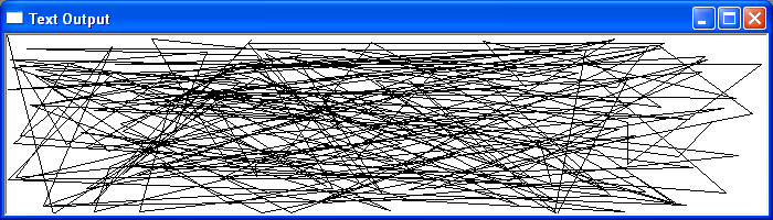
In the example below, Windows creates a device context for the application window together with a compatible memory device context. The application creates an off-screen bitmap and draws a series of random lines onto it.
When Windows sends a repaint request, the contents of the off-screen bitmap are copied to the window's device context using BitBlt(). Because the complete image has already been prepared in memory, the application can repaint the window without having to recreate every line individually.
Copying a Bitmap Using the StretchBlt Function
The StretchBlt() function copies pixels from a source device context to a destination device context while scaling the image to fit the specified destination rectangle. If the destination rectangle is larger than the source rectangle, the image is enlarged. If it is smaller, the image is reduced.
Unlike BitBlt(), which performs a direct pixel transfer without changing the dimensions of the source image, StretchBlt() performs scaling during the transfer. This makes it useful when an image needs to be displayed at a different size.
For example, an application can capture the contents of the Windows desktop into a compatible bitmap and then display that captured image inside its client area. StretchBlt() can automatically scale the captured desktop image to match the size of the application window.
A screen capture can be initiated when the user clicks the left mouse button within the application's client area. After the desktop image has been captured, the application can repaint its window using the stored bitmap whenever a repaint request is received.
The basic sequence of operations is:
- Obtain the screen device context using
GetDC(NULL). - Create a compatible memory device context using
CreateCompatibleDC(). - Create a compatible bitmap using
CreateCompatibleBitmap(). - Copy the desktop image into the memory bitmap using
BitBlt(). - Release the screen device context after the capture has been completed.
- When a
WM_PAINTmessage is received, useStretchBlt()to copy and scale the bitmap into the application's client area. - Restore the original bitmap and release the GDI resources when they are no longer required.
Note: StretchBlt() performs its scaling according to the current stretch mode. The application can select the required mode using SetStretchBltMode(). Modes include COLORONCOLOR, HALFTONE, and others, with HALFTONE generally providing higher-quality results when reducing images.
Example
In the example below, the application captures the current contents of the Windows desktop by creating a bitmap compatible with the screen device context. The captured image is copied into a memory bitmap and subsequently displayed in the application window using StretchBlt().
When the user clicks the left mouse button within the application window, a new screen capture is made. The captured bitmap is then scaled to fit the client area whenever the window receives a repaint request.
When working with GDI bitmaps, it is important to remember that device contexts and GDI objects are system resources. The application should restore previously selected objects before deleting a bitmap or device context and should release each resource when it is no longer required.
- Details
- Category: API category list
- Hits: 460