In addition to standard controls, Windows offers an extended set of child controls known as common controls that can further enhance interaction with the user. To use these common controls, an application must include the header file commctrl.h and call the function InitCommonControlsEx() to ensure that the appropriate components are loaded and initialised. This is necessary because common controls are not referenced in the standard Windows header files.
The prototype for the InitCommonControlsEx() API function is
BOOL InitCommonControlsEx (INITCOMMONCONTROLSEX const *picce);
Where *picce is a pointer to an INITCOMMONCONTROLSEX structure that determines which control classes will be registered.
The function will return TRUE if successful, or FALSE otherwise.
The prototype of theINITCOMMONCONTROLSEX structure is
typedef struct tagINITCOMMONCONTROLSEX {DWORD dwSize;DWORD dwICC;} INITCOMMONCONTROLSEX, *LPINITCOMMONCONTROLSEX;
where
dwSize indicates the size of the structure, in bytes
wICC indicates which common control classes will be loaded from the DLL.
Common Controls List
Animation Control
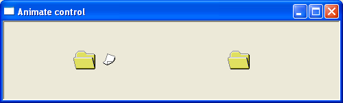
The Animation control is a Windows common control that allows an application to display AVI (Audio Video Interleave) animation clips within a window. Animation controls are designed for simple visual feedback and can only display AVI files that do not contain audio streams.
A common use of an animation control is to provide the user with an indication that a lengthy operation is currently being performed. For example, during file operations, an application may display a small animated sequence to show that processing is taking place. A well-known example was the Windows XP file copy animation, where animated sheets of paper appeared to move between folders while files were being copied.
The animation control does not play AVI files like a full media player. Instead, it is intended for short, repetitive animations that provide status information or improve the user interface.
For further reading – https://docs.microsoft.com/en-us/windows/win32/controls/animation-control-reference
The following example demonstrates the flying folder avi animation
ComboBoxEx Control
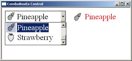
The ComboBoxEx control is an extended version of the standard Windows combo box control. It provides all the normal features of a combo box while adding additional functionality, most notably native support for images associated with list items.
Unlike a standard combo box, where each item consists only of text, a ComboBoxEx control allows each item in the drop-down list to contain:
- A text label.
- An image displayed beside the text.
- A selected image that can be shown when the item is chosen.
The images are normally stored in an image list (HIMAGELIST) and are associated with individual items using the ComboBoxEx item structure.
For further reading https://docs.microsoft.com/en-us/windows/win32/controls/comboboxex-control-reference
The following example creates a comboboxex control with 5 items. Each item has an associated bitmap image. Changing the selected item copies the text and icon to a static control.
Date and Time Picker
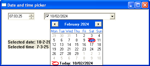
A Date and Time Picker (DTP) control provides a convenient graphical interface for entering or selecting dates and times. Rather than typing a value manually, the user can click the drop-down arrow to display a monthly calendar and choose a date. The control also allows the date and time to be adjusted using the keyboard or up/down arrow keys. The appearance and display format of the control can be customised using format strings, allowing applications to display dates in a variety of regional or application-specific formats.
For further reading https://docs.microsoft.com/en-us/windows/win32/controls/date-and-time-picker-control-reference
The following short program demonstrates the date-picker control. Changing the date or time causes the static box to be updated with the selected date and time.
Header Control
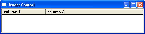
A header control is a selectable horizontal child window used to display column headings above rows of data. It is commonly used with controls such as ListView, ListBox, and user-defined list windows to identify the contents of each column. Each header consists of one or more sections (items), with each section representing the title of a column. Users can resize columns by dragging the dividers between sections, allowing the width of individual columns to be adjusted.
For further reading https://docs.microsoft.com/en-us/windows/win32/controls/header-control-reference
The following short program creates a simple window with 2 header controls. Clicking either will trigger a message box.
Hot Key Control
A hot key control allows the user to define a keyboard shortcut by pressing a combination of keys directly into the control. The control automatically interprets the key combination and displays it in a standard Windows format, making it easy for users to assign or modify keyboard shortcuts within an application.
A hot key consists of a virtual key code combined with one or more modifier keys such as Ctrl, Alt, Shift, or the Windows key. The control validates the key combination as it is entered and can restrict invalid or undesirable combinations through application-defined rules.
The selected hot key can be retrieved programmatically and stored for later use. Applications commonly register the selected key combination using the Windows RegisterHotKey() API function, allowing the shortcut to invoke commands even when the application window is not active.
Unlike a standard edit control, a hot key control does not accept arbitrary text input. Instead, it captures keyboard input and automatically formats the pressed key combination using
The following short program creates a hot key control
IP Address Control
The IP Address Control provides a specialised edit control for entering and displaying IPv4 addresses in the familiar dotted-decimal format.
Unlike a standard edit control, the IP Address control automatically divides the address into four separate numeric fields called octets. Each field accepts values only in the range 0 to 255, preventing invalid IP addresses from being entered. The control automatically moves the keyboard focus between fields as the user types, making address entry quick and intuitive.
Applications typically use the control wherever users must enter IP addresses, such as network configuration utilities, communication programs, router setup software, and server management tools.
The control validates each field as the user types, ensuring that only valid numeric values are entered. When the application needs the address, it simply retrieves the four octets and combines them into a single IP address.
The following example creates a simple IP address control
Listview
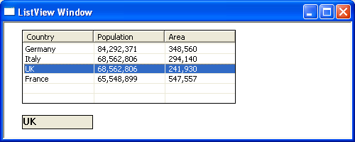
A List-View control is a common control provided by Windows that displays a collection of items. Unlike a standard ListBox, a List-View can present items in several different visual styles and can display additional information through columns and subitems.
The List-View control supports four main display modes:
Icon View
Small Icon View
List View
Report View
Allows additional information to be shown using subitems.
For further reading https://docs.microsoft.com/en-us/windows/win32/controls/list-view-control-reference
The following example creates a simple listview with 4 items. Changing the selected value will copy the contents of the first column into the static box
Month Calendar Control
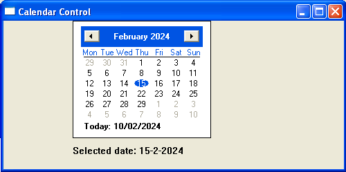
The month calendar control provides an intuitive method of entering or selecting a date. The title bar contains two buttons that allow the user to select the previous /next month.
For further reading https://docs.microsoft.com/en-us/windows/win32/controls/month-calendar-control-reference
The following example creates a simple calendar control. Changing the date updates the static box
Pager Control
A Pager control is a Windows common control that provides scrolling buttons around a child window when the child window is larger than the available display area. It is commonly used with controls such as toolbars, headers, and tab controls.
The pager control does not scroll the child window itself. Instead, it sends notifications to the parent window and moves the child window when the user presses the scroll buttons.
For further reading https://docs.microsoft.com/en-us/windows/win32/controls/pager-control-reference
In the following example, a page controller encloses the toolbar.
Progress Bar
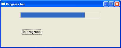
A progress bar is a graphical control used to indicate the progress of a lengthy operation, such as copying files, downloading data, or installing software. It provides visual feedback by displaying a bar that gradually fills as the operation advances. The control can operate in either determinate mode, where the percentage of completion is known, or indeterminate (marquee) mode, where the exact progress is unknown but activity is shown to reassure the user that the application is still working. Progress bars help improve the user experience by providing a clear indication of how much of a task has been completed and how much remains.
For further reading https://docs.microsoft.com/en-us/windows/win32/controls/create-progress-bar-controls
In the example below, a timer function increments a progress bar control.
Rebar Control
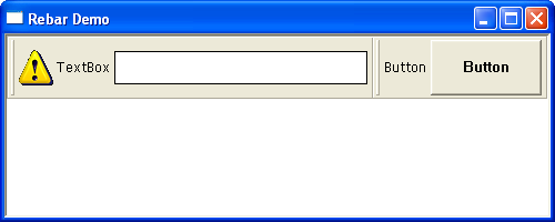
A rebar control is a container window that organizes one or more child windows into separate sections called bands. Each band can host a single child window, such as a toolbar, combo box, edit box, or other control. The user can reposition or resize these bands by dragging their gripper bars, allowing the interface to be customised. In addition to the child window, each rebar band can optionally display a gripper, a bitmap, a text label, and other visual elements, making the rebar control a flexible way to create movable and dockable user interface layouts.
For further reading https://docs.microsoft.com/en-us/windows/win32/controls/rebar-controls
The following example demonstrates the rebar control acting as a container for both a button and a textbox.
Rich Edit Control
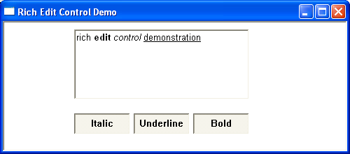
A Rich Edit control is an enhanced text editing control that allows users to enter, edit, and display formatted text. Unlike a standard edit control, a Rich Edit control supports multiple fonts, font sizes, colours, and text styles such as bold, italic, and underline within the same document. It also provides paragraph formatting, including different alignments, indentation, and tab settings, and can contain embedded objects such as images or OLE objects. Rich Edit controls are commonly used in applications that require basic word-processing capabilities, such as text editors, email clients, and note-taking programs.

For further reading https://docs.microsoft.com/en-us/windows/win32/controls/rich-edit-controls
The following example is a simple rich text box offering italic bold and underline formatting options
Status Bar
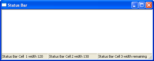
A status bar is a horizontal window, typically displayed at the bottom of an application window, that is used to display information about the current application. Status bars are often divided into parts, called panes, with each pane displaying different status information. A status bar can also contain other controls, including buttons and progress bars.
For further reading https://docs.microsoft.com/en-us/windows/win32/controls/status-bar-reference
The following example demonstrates a simple status bar with 3 cells
SysLink Control
The syslink control provides a convenient way to embed hypertext links in a window. Unlike a standard static text control, a SysLink control recognises hyperlink markup embedded within its text. Multiple hyperlinks may be displayed within the same control, while the surrounding text remains unchanged. When the user activates a hyperlink, the control sends a notification message to its parent window, allowing the application to determine which link was selected and perform the appropriate action.
This example uses the SysLink control, which was introduced with the Common Controls library version 6. As a result, it requires Windows XP or later and must be compiled with Visual Studio 2005 or a later version of Visual C++. Earlier compilers, such as Visual C++ 6.0 (VC98), do not include the necessary header files and definitions required to build SysLink applications without significant modifications.
For further reading https://docs.microsoft.com/en-us/windows/win32/controls/syslink-overview
The following example displays a simple window with a clickable link.
Tab Control
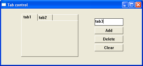
A tab control is a Windows common control that allows an application to organise related information into separate pages. Each page is selected using a tab at the top of the control. Only one page is normally visible at a time.
For further reading https://docs.microsoft.com/en-us/windows/win32/controls/tab-control-reference
The following example displays a simple adjustable tab control. Pages can be added or deleted by clicking the appropriate button.
Task Dialog
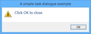
A Task Dialog is a newer Windows common control introduced with Windows Vista. Unlike a conventional message box, which is limited to a title, message, icon, and a small number of predefined buttons, a task dialog can present detailed information and guide the user through more complex decisions. This makes it particularly suitable for configuration wizards, confirmation dialogs, error reporting, and application setup.
Although the TaskDialog() API was introduced with Windows Vista, it can be compiled with Visual Studio 2005, 2008, 2010, 2012, 2013, and newer, provided the Windows SDK being used contains the necessary headers and libraries.
For further reading https://docs.microsoft.com/en-us/windows/win32/controls/task-dialogs-overview
The following short program demonstrates a simple task dialog
Toolbar Control
Toolbars can be created using the CreateWindowEx() function, specifying TOOLBARCLASSNAME as the window class name, or by using the deprecated CreateToolbarEx() function. A TBBUTTON structure contains the information describing each toolbar button. These buttons are added to the toolbar by sending the TB_ADDBUTTONS or TB_INSERTBUTTON message using the SendMessage() function. Toolbar images are stored in an image list (HIMAGELIST), which is associated with the toolbar using the TB_SETIMAGELIST message. Each toolbar button references an image in the image list through its iBitmap member. When a toolbar button is clicked, the parent window receives a WM_COMMAND message, with the button identifier stored in the low-order word of wParam.
For in-depth reading on the creation of toolbars
https://docs.microsoft.com/en-us/windows/win32/controls/toolbar-control-reference
The following short program creates a simple toolbar with two buttons using the following two images. Clicking either button will produce a message box.

See creating toolbar page for a detailed description of the toolbar control.
Tooltip
A tooltip control is a Windows common control that automatically pops up when the user pauses the mouse pointer over an application element and displays a brief message explaining the purpose of a particular feature. Tooltips are part of the help system of an application.

For further reading https://docs.microsoft.com/en-us/windows/win32/controls/tooltip-control-reference
The following short program demonstrates a simple tooltip window. Placing the map over the button causes the tooltip to appear
Trackbar Control
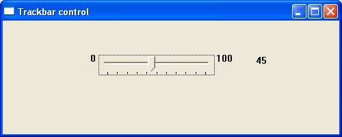
A Trackbar control (also called a slider control) allows a user to select a value from a range by moving a selector between its minimum and maximum points. The TrackBar control has two parts: an adjustable thumb or slider, and optional tick marks. When the user moves the slider, using either the mouse or the direction keys, the control sends notification messages to indicate the change.
For further reading - https://docs.microsoft.com/en-us/windows/win32/controls/using-trackbar-controls
The following program demonstrates a simple trackbar control with values from 0-100. Changes in value will be reflected in the neighbouring buddy window.
Tree-View Control
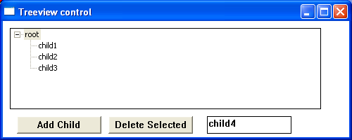
A tree-view is a window that displays a hierarchical list of labelled items or nodes. Each item can have an associated number of subitems. The top item in the hierarchy is called the root. If an item has other items below it in the hierarchy, it is referred to as a parent. Items subordinate to parents are called children. The hierarchy may be expanded or collapsed at any level to display or hide child items.
For further reading - https://docs.microsoft.com/en-us/windows/win32/controls/tree-view-control-reference
The following program demonstrates the Treeview control. Nodes can be added or deleted by clicking the appropriate button.
Updown Control
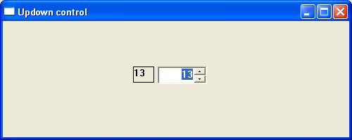
The Updown or spinner control consists of two buttons displayed as arrows with an optional buddy control. The most common buddy control is an edit box and the combination of the two is called a spinner control. Clicking either of the arrows increments or decrements the value in the edit control.
For further reading https://docs.microsoft.com/en-us/windows/win32/controls/up-down-control-reference
The following short program demonstrates a spinner control. Any changes in the control are reflected in the neighbouring static box.